Laura Willoughby
Books & Posters
Fakebook
This series, Fakebook, is a collection of book covers. Their designs vary to best align the theme of the titles to fit multiple genres. Particular details worth mentioning for “The Village Idiot” is an original typeface used for the word “idiot” to fit the theme of the book. Along with the cover picture for “Window to a Boring Life” which is an original photo.
Humor?
In MY Design?
(Book version)
The main focus behind the three chosen ted talks is about finding humor in your design approach and not losing your sense of self. The cover focused more on play with the back being subtle sarcastic jab at the supposed humorous approach. The inside of the french folded book was designed to play with negative space and a crisp, modern appearance contained within a 5 columns structure. Each chapter has its own unique design layout, but are all united through the red ink from start to finish.
Space Posters
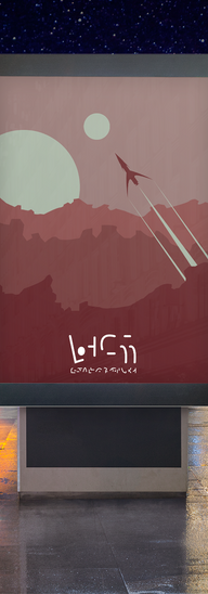
The series, Space Travel, is inspired by retro travel posters and the video game No Man’s Sky. The goal was to create something simple and repetitive from the perspective of an alien travel agency. At the bottom, the language was designed to be familiar in shape and stroke with the font elongated and thin as a call back
to Art Deco.
Humor?
In MY Design?
(Poster Version)
While inspired by more illustrative designs/concepts, the final result focuses on strong typography. The busy white pattern for the background used the original typeface turned white that is disrupted by the pointed star that includes the title. The essential information is included in the white and red boxes at the bottom. The information uses size, color, and weight to differentiate the hierarchy. Lastly, the ted logo is integrated with the “haha” pattern in poster, but it is bold enough that it catches the eye.
First Poster is final result. The other posters show the process it took to come to the reach the end.


